Seaborn - exploring distributions
 Seaborn is an amazing data and statistical visualization library that is built using matplotlib. It has good defaults and very easy to use.
import seaborn as sns
%matplotlib inline
Load sample dataset
Seaborn comes with a number of example dataset. Let us load the restaurant tipping dataset
tips = sns.load_dataset('tips')
tips.head(5)
| total_bill | tip | sex | smoker | day | time | size | |
|---|---|---|---|---|---|---|---|
| 0 | 16.99 | 1.01 | Female | No | Sun | Dinner | 2 |
| 1 | 10.34 | 1.66 | Male | No | Sun | Dinner | 3 |
| 2 | 21.01 | 3.50 | Male | No | Sun | Dinner | 3 |
| 3 | 23.68 | 3.31 | Male | No | Sun | Dinner | 2 |
| 4 | 24.59 | 3.61 | Female | No | Sun | Dinner | 4 |
Distribution plots
One of the first things we do is to find the data dist.
#find dist of total bills
sns.distplot(tips['total_bill'])
<matplotlib.axes._subplots.AxesSubplot at 0x10eafbd68>

It is often useful to overlay the mean and SD with the histograms, below is one way to do it.
tips.total_bill.mean()
19.78594262295082
tips_mean = tips.total_bill.mean()
tips_sd = tips.total_bill.std()

ax = sns.distplot(tips['total_bill'])

# plot mean in black
ax.axvline(x=tips_mean, color='black', linestyle='dashed')

# plot mean +- 1SD in red, dotted
ax.axvline(x=tips_mean + tips_sd, color='red', linestyle='dotted')
ax.axvline(x=tips_mean - tips_sd, color='red', linestyle='dotted')

# title
ax.set_title('$\mu = {}$ | $\sigma = {}$'.format(round(tips_mean, 2), round(tips_sd, 2)))
Text(0.5,1,'$\\mu = 19.79$ | $\\sigma = 8.9$')

You can change things like bin, kde flags to customize the plot
sns.distplot(tips['total_bill'], kde=False, bins=35)
<matplotlib.axes._subplots.AxesSubplot at 0x1153353c8>

Plotting dist of 2 variables
Seaborn can very easily attach a histogram to a scatter plot to show the data distribution
sns.jointplot(x=tips['total_bill'], y=tips['tip'])
<seaborn.axisgrid.JointGrid at 0x1179c1358>

You can use the kind argument to change the scatter to hex, reg etc
Annotating correlation coefficient and p value if unavailable
Note: In recent versions, seaborn does not print the correlation coefficient and its p-value. To get this, use annotation as shown below:
jgrid = sns.jointplot(x='min_season', y='max_wind_merged', data=hurricanes_ipl,
             kind='reg', joint_kws={'line_kws':{'color':'green'}}, height=7, space=0.5)
j = jgrid.annotate(stats.pearsonr)
j = jgrid.ax_joint.set_title('Does hurricane wind speed increase over time?')

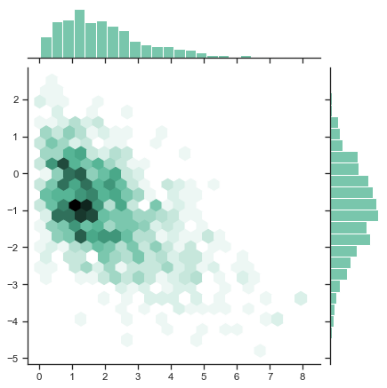
sns.jointplot(x=tips['total_bill'], y=tips['tip'], kind='hex')
<seaborn.axisgrid.JointGrid at 0x117b95c88>

sns.jointplot(x=tips['total_bill'], y=tips['tip'], kind='reg') #regression
<seaborn.axisgrid.JointGrid at 0x1182819e8>

Plotting dist of all variables
You can get a quick overview of the pariwise relationships between your columns using pairplot. Specifying a categorical variable to hue argument will shade it accordingly
sns.pairplot(tips, hue='sex')
<seaborn.axisgrid.PairGrid at 0x11908f390>

Plotting data frequency
Histograms provide data frequency. The distplot gives histograms. Another way to viz this is using rugplot. Rug plots are similar to the trading frequency bars we see in stock ticker time series datasets.
sns.rugplot(tips['total_bill'])
<matplotlib.axes._subplots.AxesSubplot at 0x1196baa58>
