Seaborn - categorical plotting
import seaborn as sns
%matplotlib inline
tips = sns.load_dataset('tips')
tips.head()
| total_bill | tip | sex | smoker | day | time | size | |
|---|---|---|---|---|---|---|---|
| 0 | 16.99 | 1.01 | Female | No | Sun | Dinner | 2 |
| 1 | 10.34 | 1.66 | Male | No | Sun | Dinner | 3 |
| 2 | 21.01 | 3.50 | Male | No | Sun | Dinner | 3 |
| 3 | 23.68 | 3.31 | Male | No | Sun | Dinner | 2 |
| 4 | 24.59 | 3.61 | Female | No | Sun | Dinner | 4 |
Barplot
Barplot is used to indicate some measure of central tendancy. Seaborn adds some descriptors to indicate the variance in the data. Call this with a categorical column in X and numerical column for Y
sns.barplot(x='sex', y='total_bill', data=tips)
<matplotlib.axes._subplots.AxesSubplot at 0x1101e1860>
Thus the average bill for men was higher than women.
Countplot
If you want a regular bar chart that shows the count of data, then do a countplot
sns.countplot(x='sex', data=tips)
<matplotlib.axes._subplots.AxesSubplot at 0x1127c1320>
Boxplot
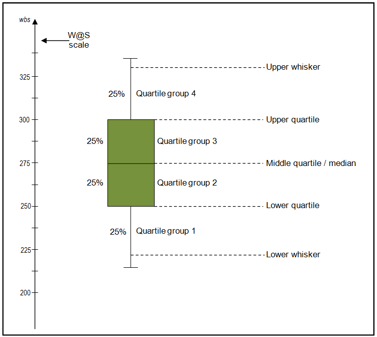
Boxplots are very common. It is used to display distribution of data as well as outliers. A boxplot splits the data into 4 quantiles or quartiles. The median is represented as a horizontal line with the quartile +- medain in solid shade. The end of the whiskers may represent the ends of the remaining quartiles

If outliers are calculated, then whiskers are shorter and values greater than 1.5 times the IQR - Inter Quartile Range are considered outliers.
sns.boxplot(x='time', y='total_bill', data=tips)
<matplotlib.axes._subplots.AxesSubplot at 0x1129ecdd8>
We can interpret this as people spend more on dinner on average than lunch. The median is higher. Yet there is higher variability as well with the amount spent on dinner. The lowest being lower than lunch.
sns.boxplot(x='time',y='total_bill', data=tips, hue='sex')
<matplotlib.axes._subplots.AxesSubplot at 0x1150d1278>
Violin plot
A violin plot builds on a boxplot by showing KDE of the data distribution.
sns.violinplot(x='time',y='total_bill', data=tips)
<matplotlib.axes._subplots.AxesSubplot at 0x1155731d0>
You can see, lunch bills are tighter around the median compared to dinner. The Q3 of dinner is long, which can be noticed in the spread of the green violin plot.
sns.violinplot(x='time', y='total_bill', data=tips, hue='sex', split=True)
<matplotlib.axes._subplots.AxesSubplot at 0x115587fd0>
From this plot, we assert our experience so far that women's bills are lesser than men - the width of the violin is higher on the lower end.
Stirp plot
Strip plot is like a scatter plot for a categorial data. You specify a categorial column for X and numeric for Y.
sns.stripplot(x='time', y='total_bill', data=tips)
<matplotlib.axes._subplots.AxesSubplot at 0x11577bd68>
To make out the data distribution, you can add some jitter to the plot. Jitter will shift the points laterally in a random manner.
sns.stripplot(x='time', y='total_bill', data=tips, jitter=True)
<matplotlib.axes._subplots.AxesSubplot at 0x115637518>
Swarm plot
Swram plots are a combination of violin and strip plots. It shows the real data distribution using actual point values.
sns.swarmplot(x='time', y='total_bill', data=tips)
<matplotlib.axes._subplots.AxesSubplot at 0x115997978>
You can combine a violin and swarm plot to see how the KDE is calculated and smooths
sns.violinplot(x='time', y='total_bill', data=tips)
sns.swarmplot(x='time', y='total_bill', data=tips, color='black')
<matplotlib.axes._subplots.AxesSubplot at 0x1159aa278>